ECAS2019
Lab 2: Intensity – solutions
This session covers exploratory tools and formal model-fitting procedures for investigating intensity.
library(spatstat)
Exercise 1
The dataset japanesepines contains the locations of Japanese Black
Pine trees in a study region.
-
Plot the
japanesepinesdata.We use the generic
plotfunction which is dispatched toplot.ppp:plot(japanesepines)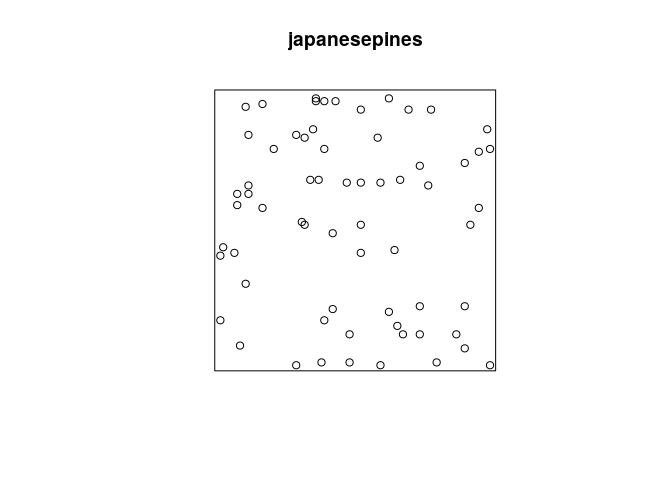
-
What is the average intensity (the average number of points per unit area?
The average intensity can be computed via
intensity.ppp:intensity(japanesepines)## [1] 65 -
Using
density.ppp, compute a kernel estimate of the spatially-varying intensity function for the Japanese pines data, using a Gaussian kernel with standard deviationunits, and store the estimated intensity in an object
Dsay.From the documentation (
?density.ppp) we see that the following will work:D <- density(japanesepines, sigma = 0.1) -
Plot a colour image of the kernel estimate
D.The plotting of the colour image is automatically done by dispatched call to the
plot.immethod by callingploton theimobject.plot(D, main = "")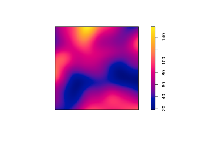
-
Most plotting commands will accept the argument
add=TRUEand interpret it to mean that the plot should be drawn over the existing display, without clearing the screen beforehand. Use this to plot a colour image of the kernel estimateDwith the original Japanese Pines data superimposed.We can use the
add = TRUEfunctionality of the plotting methods.plot(D, main = "") plot(japanesepines, add = TRUE, cols = "white", cex = 0.5, pch = 16)
-
Plot the kernel estimate without the ‘colour ribbon’.
From
help("plot.im")we see thatribbon = FALSEdisables the colour key:plot(D, main = "", ribbon = FALSE) plot(japanesepines, add = TRUE, cols = "white", cex = 0.5, pch = 16)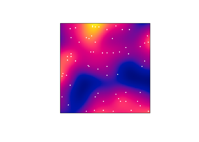
-
Try the following command
persp(D, theta=70, phi=25, shade=0.4) and
find the documentation for the arguments
 theta,phiandshade.It dispatches to
persp.im, but these arguments are then passed down topersp.defaultthrough the dots (...). From the documentation ofpersp.defaultthey are “angles defining the viewing direction.thetagives the azimuthal direction andphithe colatitude.” Theshadecontrols the shading of the surface facets.persp(D, theta=70, phi=25, shade=0.4, main = "")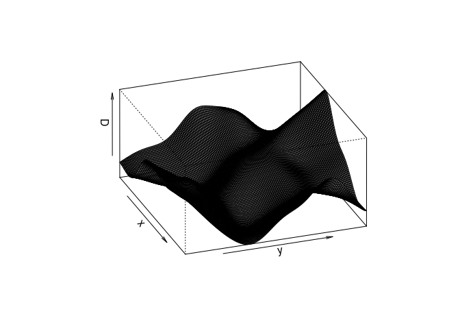
-
Find the maximum and minimum values of the intensity estimate over the study region. (Hint: Use
summaryorrange)range(D)## [1] 17.47221 157.95229 -
The kernel estimate of intensity is defined so that its integral over the entire study region is equal to the number of points in the data pattern, ignoring edge effects. Check whether this is approximately true in this example. (Hint: use
integral)Calling
integral.imwe see that the integral is close to the observed number of points 65:round(integral(D))## [1] 64
Exercise 2
The bei dataset gives the locations of trees in a survey area with
additional covariate information in a list bei.extra.
-
Assign the elevation covariate to a variable
elevby typingelev <- bei.extra$elev -
Plot the trees on top of an image of the elevation covariate.
plot(elev)
plot(bei, add = TRUE, col = "black")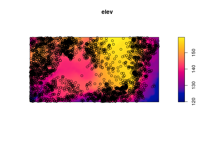
-
Assume that the intensity of trees is a function
where
is the terrain elevation at location u. Compute a nonparametric estimate of the function
and plot it by
rh <- rhohat(bei, elev)
plot(rh)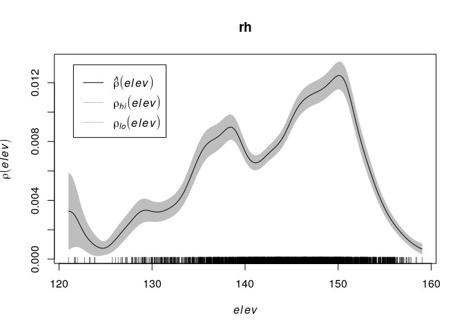
-
Compute the predicted intensity based on this estimate of
.
prh <- predict(rh)
plot(prh, main = "")
plot(bei, add = TRUE, cols = "white", cex = .2, pch = 16)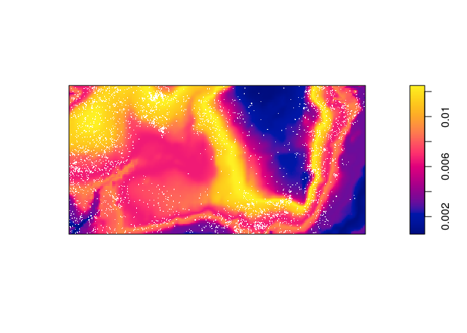
-
Compute a non-parametric estimate of intensity by kernel smoothing, and compare with the predicted intensity above.
The kernel density estimate of the points is computed and plotted with the following code:
dbei <- density(bei, sigma = bw.scott)
plot(dbei, main = "")
plot(bei, add = TRUE, cols = "white", cex = .2, pch = 16)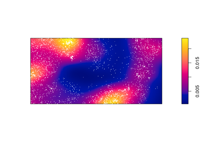
Which seems to be quite different form the predicted intentisty.
-
Bonus info: To plot the two intensity estimates next to each other you collect the estimates as a spatial object list (
solist) and plot the result (the estimates are calledpredandkerbelow):l <- solist(pred, ker) plot(l, equal.ribbon = TRUE, main = "", main.panel = c("rhohat prediction", "kernel smoothing"))l <- solist(prh, dbei) plot(l, equal.ribbon = TRUE, main = "", main.panel = c("rhohat prediction", "kernel smoothing"))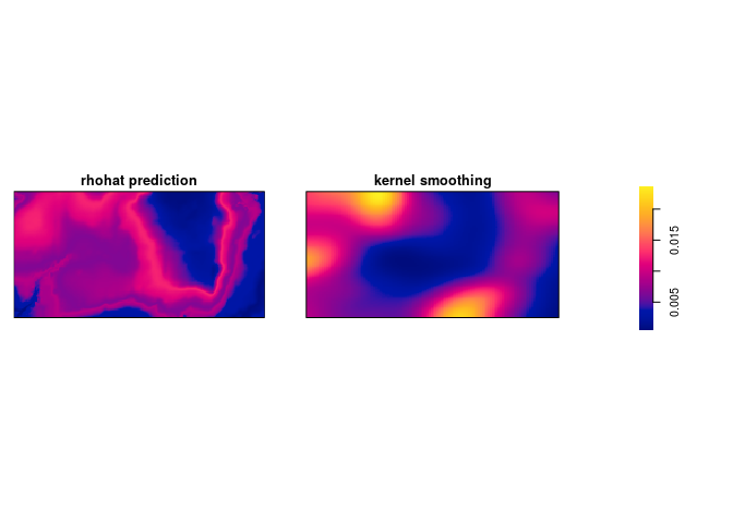
Exercise 3
The command rpoispp(100) generates realisations of the Poisson process
with intensity in the unit square.
-
Repeat the command
plot(rpoispp(100))several times to build your intuition about the appearance of a completely random pattern of points.Let’s plot it three times:
replicate(3, plot(rpoispp(lambda = 100), main = ""))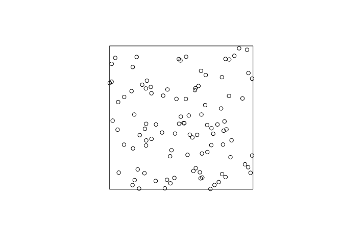
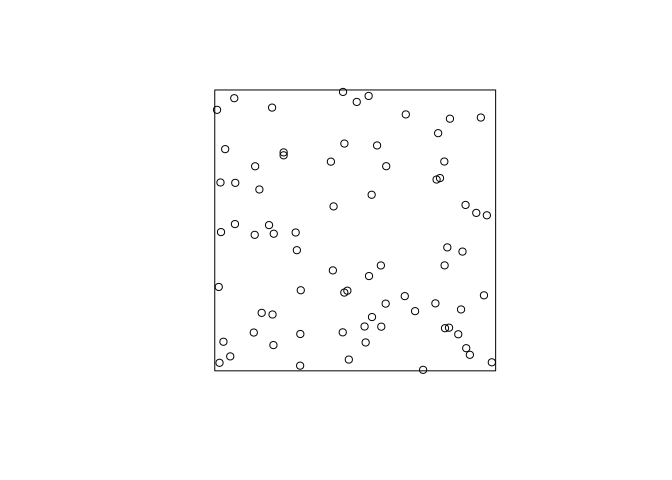
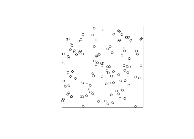
As can be seen, the points (unsurprisingly) are much more random that want one might think. “Randomly” drawing points on a piece of paper one would usually draw a point pattern that is more regular (i.e. the points are repulsive).
-
Try the same thing with intensity
.
For brevity we only do it once here:
plot(rpoispp(lambda = 1.5), main = "")
Here we expect 1.5 points in the plot each time.
Exercise 4
Returning to the Japanese Pines data,
-
Fit the uniform Poisson point process model to the Japanese Pines data
ppm(japanesepines~1)We fit the Poisson process model with the given command and print the output:
m.jp <- ppm(japanesepines ~ 1)
print(m.jp)
## Stationary Poisson process ## Intensity: 65 ## Estimate S.E. CI95.lo CI95.hi Ztest Zval ## log(lambda) 4.174387 0.1240347 3.931284 4.417491 *** 33.65499 -
Read off the fitted intensity. Check that this is the correct value of the maximum likelihood estimate of the intensity.
We extract the coeficient with the
coeffunction, and compare to the straightforward estimate obtained by `intensity``:unname(exp(coef(m.jp)))## [1] 65intensity(japanesepines)## [1] 65As seen, they agree exactly.
Exercise 5
The japanesepines dataset is believed to exhibit spatial
inhomogeneity.
-
Plot a kernel smoothed intensity estimate.
Plot the kernel smoothed intensity estimate selecting the bandwidth with
bw.scott:jp.dens <- density(japanesepines, sigma = bw.scott) plot(jp.dens) plot(japanesepines, col = "white", cex = .4, pch = 16, add = TRUE)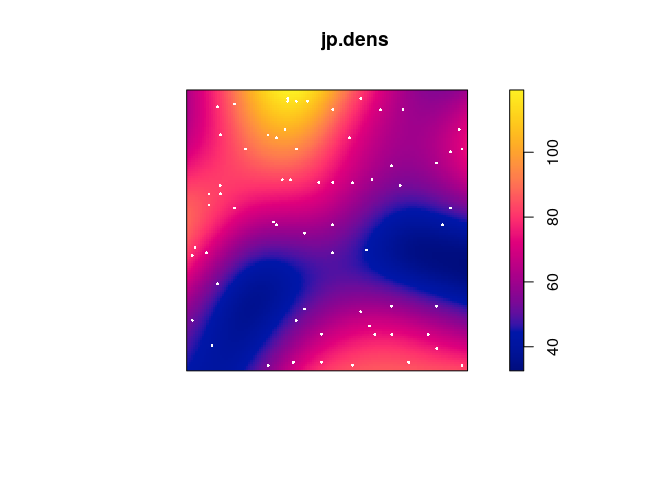
-
Fit the Poisson point process models with loglinear intensity (trend formula
~x+y) and log-quadratic intensity (trend formula~polynom(x,y,2)) to the Japanese Pines data.We fit the two models with
ppm:jp.m <- ppm(japanesepines ~ x + y) jp.m2 <- ppm(japanesepines ~ polynom(x, y, 2) ) -
extract the fitted coefficients for these models using
coef.coef(jp.m)## (Intercept) x y ## 4.0670790 -0.2349641 0.4296171coef(jp.m2)## (Intercept) x y I(x^2) I(x * y) I(y^2) ## 4.0645501 1.1436854 -1.5613621 -0.7490094 -1.2009245 2.5061569 -
Plot the fitted model intensity (using
plot(predict(fit)))par(mar=rep(0,4)) plot(predict(jp.m), main = "")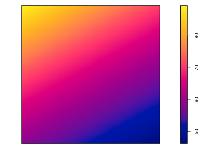
plot(predict(jp.m, se=TRUE)$se, main = "")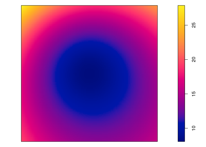
plot(predict(jp.m2), main = "")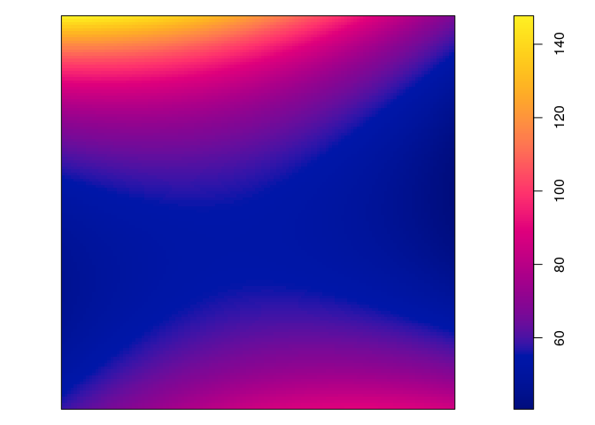
plot(predict(jp.m2, se=TRUE)$se, main = "")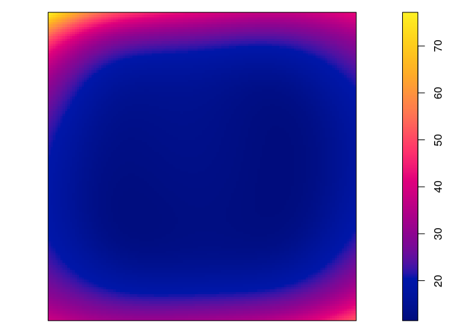
-
perform the Likelihood Ratio Test for the null hypothesis of a loglinear intensity against the alternative of a log-quadratic intensity, using
anova.anova(jp.m, jp.m2)## Analysis of Deviance Table ## ## Model 1: ~x + y Poisson ## Model 2: ~x + y + I(x^2) + I(x * y) + I(y^2) Poisson ## Npar Df Deviance ## 1 3 ## 2 6 3 3.3851 -
Generate 10 simulated realisations of the fitted log-quadratic model, and plot them, using
plot(simulate(fit, nsim=10))wherefitis the fitted model.par(mar=rep(0.5,4)) plot(simulate(jp.m2, nsim=10), main = "")## Generating 10 simulated patterns ...1, 2, 3, 4, 5, 6, 7, 8, 9, 10.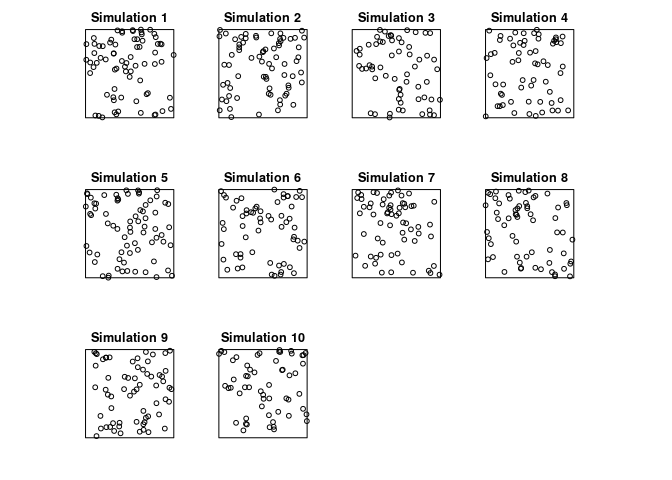
Exercise 6
The update command can be used to re-fit a point process model using a
different model formula.
-
Type the following commands and interpret the results:
fit0 <- ppm(japanesepines ~ 1) fit1 <- update(fit0, . ~ x) fit1## Nonstationary Poisson process ## ## Log intensity: ~x ## ## Fitted trend coefficients: ## (Intercept) x ## 4.2895587 -0.2349362 ## ## Estimate S.E. CI95.lo CI95.hi Ztest Zval ## (Intercept) 4.2895587 0.2411952 3.816825 4.7622926 *** 17.7845936 ## x -0.2349362 0.4305416 -1.078782 0.6089098 -0.5456759fit2 <- update(fit1, . ~ . + y) fit2## Nonstationary Poisson process ## ## Log intensity: ~x + y ## ## Fitted trend coefficients: ## (Intercept) x y ## 4.0670790 -0.2349641 0.4296171 ## ## Estimate S.E. CI95.lo CI95.hi Ztest Zval ## (Intercept) 4.0670790 0.3341802 3.4120978 4.7220602 *** 12.1703167 ## x -0.2349641 0.4305456 -1.0788181 0.6088898 -0.5457357 ## y 0.4296171 0.4318102 -0.4167154 1.2759495 0.9949211OK, let’s do that:
fit0 <- ppm(japanesepines ~ 1) fit1 <- update(fit0, . ~ x) fit1## Nonstationary Poisson process ## ## Log intensity: ~x ## ## Fitted trend coefficients: ## (Intercept) x ## 4.2895587 -0.2349362 ## ## Estimate S.E. CI95.lo CI95.hi Ztest Zval ## (Intercept) 4.2895587 0.2411952 3.816825 4.7622926 *** 17.7845936 ## x -0.2349362 0.4305416 -1.078782 0.6089098 -0.5456759fit2 <- update(fit1, . ~ . + y) fit2## Nonstationary Poisson process ## ## Log intensity: ~x + y ## ## Fitted trend coefficients: ## (Intercept) x y ## 4.0670790 -0.2349641 0.4296171 ## ## Estimate S.E. CI95.lo CI95.hi Ztest Zval ## (Intercept) 4.0670790 0.3341802 3.4120978 4.7220602 *** 12.1703167 ## x -0.2349641 0.4305456 -1.0788181 0.6088898 -0.5457357 ## y 0.4296171 0.4318102 -0.4167154 1.2759495 0.9949211 -
Now type
step(fit2)and interpret the results.The backwards selection is done with the code:
step(fit2)## Start: AIC=-407.96 ## ~x + y ## ## Df AIC ## - x 1 -409.66 ## - y 1 -408.97 ## <none> -407.96 ## ## Step: AIC=-409.66 ## ~y ## ## Df AIC ## - y 1 -410.67 ## <none> -409.66 ## ## Step: AIC=-410.67 ## ~1 ## Stationary Poisson process ## Intensity: 65 ## Estimate S.E. CI95.lo CI95.hi Ztest Zval ## log(lambda) 4.174387 0.1240347 3.931284 4.417491 *** 33.65499First, given two models the preferred model is the one with the minimum AIC value. In step 1, the removal of x results in the least AIC and is hence deleted. In step 2, removing y results in a lower AIC than not deleing anything and is thus deleted. This results in the constant model.
Exercise 7
The bei dataset gives the locations of trees in a survey area with
additional covariate information in a list bei.extra.
-
Fit a Poisson point process model to the data which assumes that the intensity is a loglinear function of terrain slope and elevation (hint: use
data = bei.extrainppm).We fit the log-linear intensity model with the following:
bei.m <- ppm(bei ~ elev + grad, data = bei.extra) -
Read off the fitted coefficients and write down the fitted intensity function.
The coefficents are extraced with
coef:coef(bei.m)## (Intercept) elev grad ## -8.56355220 0.02143995 5.84646680Hence the model is
where
and
is the elevation and gradient, respectively, at
.
-
Plot the fitted intensity as a colour image.
plot(predict(bei.m), main = "") plot(bei, cex = 0.3, pch = 16, cols = "white", add = TRUE)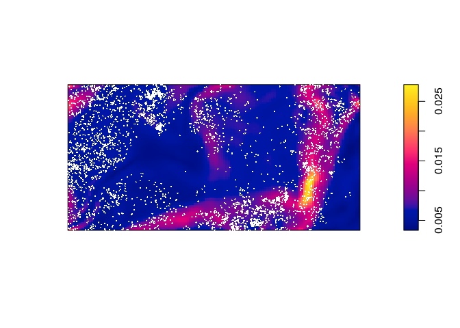
-
extract the estimated variance-covariance matrix of the coefficient estimates, using
vcov.We call
vcovon the fitted model object:vcov(bei.m)## (Intercept) elev grad ## (Intercept) 0.1163586583 -7.774771e-04 -0.0354792767 ## elev -0.0007774771 5.234331e-06 0.0001992266 ## grad -0.0354792767 1.992266e-04 0.0654239289 -
Compute and plot the standard error of the intensity estimate (see
help(predict.ppm)).From the documentation the argument
sewill trigger the computation of the standard errors. These are then plotted in the standard manner.std.err <- predict(bei.m, se = TRUE)$se plot(std.err, main = "")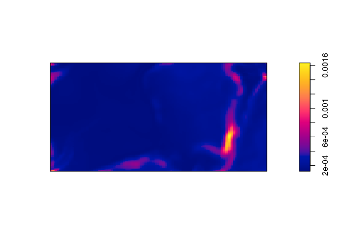
Exercise 8
Fit Poisson point process models to the Japanese Pines data, with the following trend formulas. Read off an expression for the fitted intensity function in each case.
| Trend formula | Fitted intensity function |
|---|---|
~1 |
|
~x |
|
~sin(x) |
|
~x+y |
|
~polynom(x,y,2) |
|
~factor(x < 0.4) |
(Here, denote the indicator function.)
The fitted intensity functions have been written into the table based on the follwing model fits:
coef(ppm1 <- ppm(japanesepines ~ 1))
## log(lambda)
## 4.174387
coef(ppm2 <- ppm(japanesepines ~ x))
## (Intercept) x
## 4.2895587 -0.2349362
coef(ppm3 <- ppm(japanesepines ~ sin(x)))
## (Intercept) sin(x)
## 4.2915935 -0.2594537
coef(ppm4 <- ppm(japanesepines ~ x + y))
## (Intercept)           x           y
##   4.0670790  -0.2349641   0.4296171
coef(ppm5 <- ppm(japanesepines ~ polynom(x, y, 2)))
## (Intercept)           x           y      I(x^2)    I(x * y)      I(y^2)
##   4.0645501   1.1436854  -1.5613621  -0.7490094  -1.2009245   2.5061569
coef(ppm6 <- ppm(japanesepines ~ factor(x < 0.4)))
##         (Intercept) factor(x < 0.4)TRUE
##           4.1048159           0.1632665
Exercise 9
Make image plots of the fitted intensities for the inhomogeneous models above.
Again, we use plot(predict()):
plot(predict(ppm1), main = "")

plot(predict(ppm2), main = "")
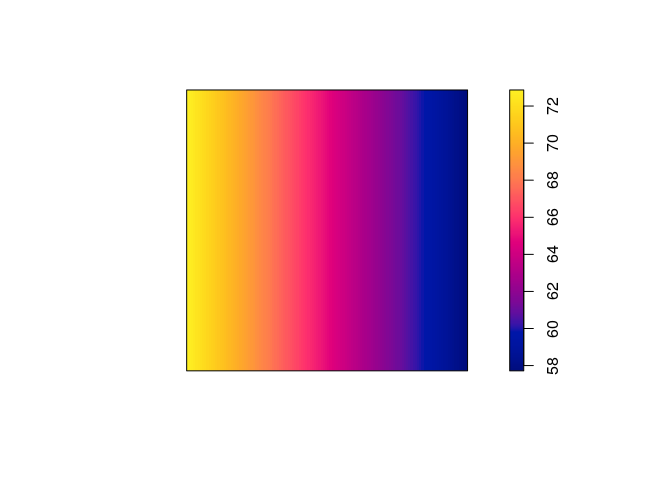
plot(predict(ppm3), main = "")
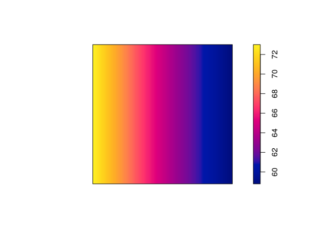
plot(predict(ppm4), main = "")
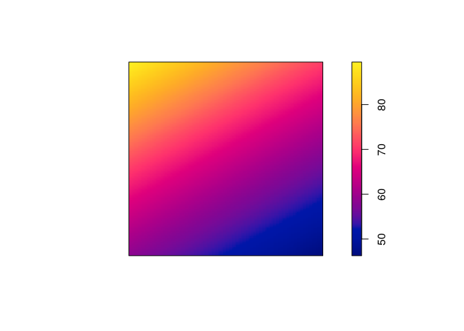
plot(predict(ppm5), main = "")
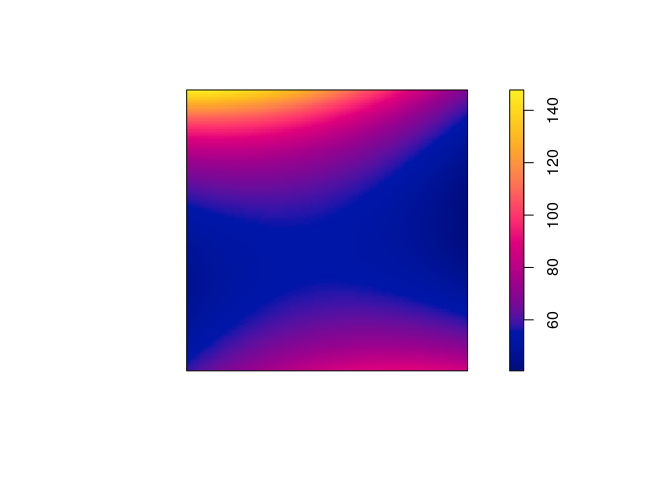
plot(predict(ppm6), main = "")

Exercise 10
The dataset hamster is a multitype pattern representing the locations
of cells of two types, dividing and pyknotic.
-
plot the patterns of pyknotic and dividing cells separately;
plot(split(hamster), main = "")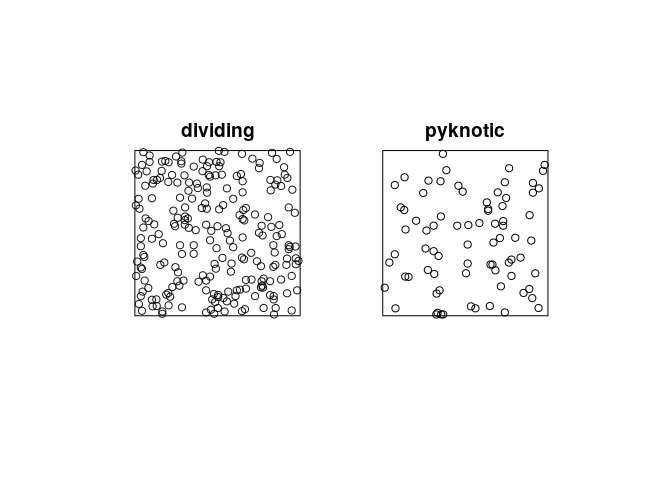
-
plot kernel estimates of the intensity functions of pyknotic and dividing cells separately;
plot(density(split(hamster)), main = "")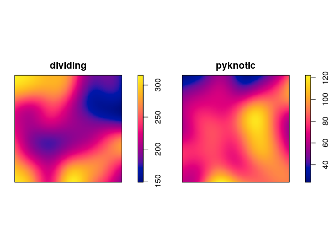
-
use
relriskto perform cross-validated bandwidth selection and computation of the relative intensity of pyknotic cells.plot(relrisk(hamster, hmax = 1, relative = TRUE, control = "dividing"))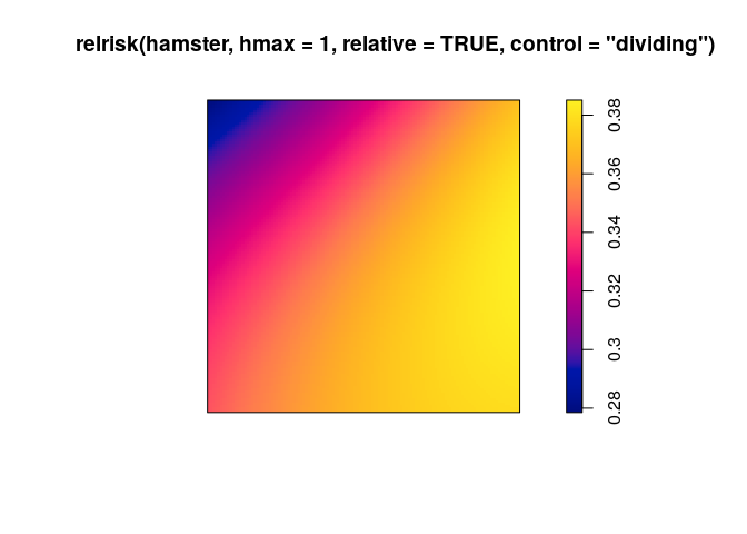
Exercise 11
The dataset ants is a multitype point pattern representing the
locations of nests of two species of ants.
-
plot the data.
plot(ants)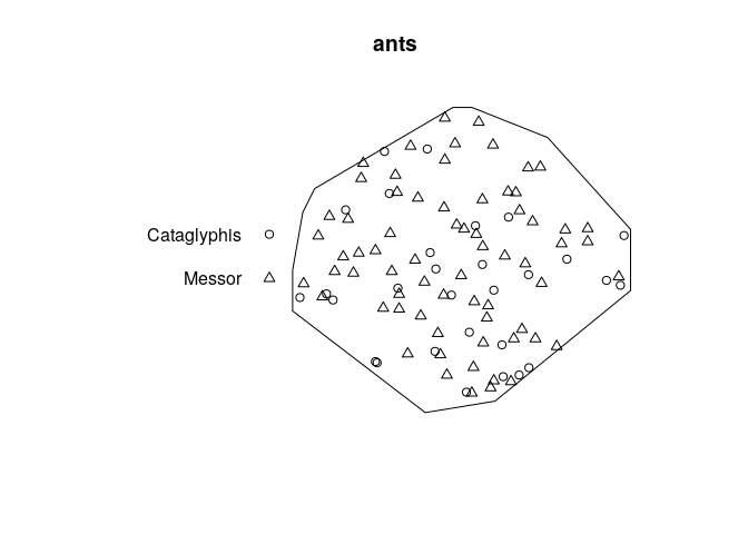
-
Fit the model
ppm(ants ~ marks)and interpret the result. Compare the result withsummary(ants)and explain the similarities.fit1 <- ppm(ants ~ marks)This is a Poisson model with a separate constant intensity for each mark. The fitted intensities are:
exp(coef(fit1)[1])## (Intercept) ## 6.762949e-05exp(coef(fit1)[1] + coef(fit1)[2])## (Intercept) ## 0.0001585795This agrees perfectly with the output of
summary(ants):summary(ants)## Marked planar point pattern: 97 points ## Average intensity 0.0002261486 points per square unit (one unit = 0.5 feet) ## ## Coordinates are integers ## i.e. rounded to the nearest unit (one unit = 0.5 feet) ## ## Multitype: ## frequency proportion intensity ## Cataglyphis 29 0.2989691 6.761144e-05 ## Messor 68 0.7010309 1.585372e-04 ## ## Window: polygonal boundary ## single connected closed polygon with 11 vertices ## enclosing rectangle: [-25, 803] x [-49, 717] units ## Window area = 428922 square units ## Unit of length: 0.5 feet ## Fraction of frame area: 0.676 -
Fit the model
ppm(ants ~
marks + x)
and write down an expression for the fitted intensity function.fit2 <- ppm(ants ~ marks + x) (co <- coef(fit2))## (Intercept) marksMessor x ## -9.5243832518 0.8522118655 -0.0002041438Intensity for the reference type (Cataglyphis):
Intensity for the other type (Messor):
-
Fit the model
ppm(ants ~ marks * x)and write down an expression for the fitted intensity function.fit3 <- ppm(ants ~ marks * x) (co <- coef(fit3))## (Intercept) marksMessor x marksMessor:x ## -9.605698e+00 9.676854e-01 1.107981e-05 -3.071343e-04Intensity for the reference type (Cataglyphis):
Intensity for the other type (Messor):
-
Compute the fitted intensities of the three models fitted above using
predictand plot the results.pred <- c(predict(fit1), predict(fit2), predict(fit3)) plot(as.solist(pred), ncols = 2, main = "")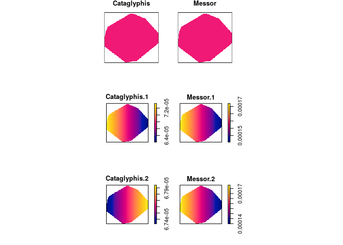
-
Explain the difference between the models fitted by
ppm(ants ~ marks + x)andppm(ants ~ marks * x).For the additive model the effect of the
xcoordinate is the same for both types of ants, while the effect ofxdiffers in the multiplicative model.
Exercise 12
The study region for the ants’ nests data ants is divided into areas
of “scrub” and “field”. We want to fit a Poisson model with different
intensities in the field and scrub areas.
The coordinates of two points on the boundary line between field and
scrub are given in ants.extra$fieldscrub. First construct a function
that determines which side of the line we are on:
fs <- function(x,y) {
  ends <- ants.extra$fieldscrub
  angle <- atan(diff(ends$y)/diff(ends$x))
  normal <- angle + pi/2
  project <- (x - ends$x[1]) * cos(normal) + (y - ends$y[1]) * sin(normal)
  factor(ifelse(project > 0, "scrub", "field"))
}
Now fit the models:
ppm(ants ~ marks + side, data = list(side=fs))
ppm(ants ~ marks * side, data = list(side=fs))
and interpret the results.
fit1 <- ppm(ants ~ marks + side, data = list(side=fs))
fit2 <- ppm(ants ~ marks * side, data = list(side=fs))
In the first model the fitted intensity is lower in the scrub than in the field (but this effect is not significant).
In the second model the fitted intensity of Cataglyphis is lower in the scrub than the intensity of Cataglyphis in the field, where as it is the other way around for Messor. When we allow for the different effect between ant types the scrub/field covariate is significant.